
Launch: J-LTF website Ver.2 l 10 January 2023
Jung-Lee Type Foundry (J-LTF) is a digital platform based in Amsterdam, NL, exploring the intersection between typographic forms and emotions through various mediums. J-LTF was founded in 2015 by Jungmyung Lee. The first J-LTF website was launched on April 13, 2016, programmed by Ingo Valente. The newer website – with user-friendly functions and a Membership scheme – was programmed by Arthur Haegeman.

Release: Pirelli l 5 September 2018 l Image image courtesy of OASE, Designed by Aagje Martens and Karel Martens
Pirelli is the second typeface developed collaboratively between Karel Martens and Jungmyung Lee, following their first collaboration on Jungka.
Pirelli is a revival of an anonymous grotesque typeface that Karel Martens once came across. Its mostly horizontal and vertical features with a mono-line structure and an absence of flourishes give it a concise expression. Yet it has the distinctive motif of unusually high-waisted capitals, visible in all letters with bars, such as ‘E’, ‘F’, and ‘P’. This feature gives Pirelli the atmosphere of earlier Art Nouveau and Secessionist lettering. However, the radically considered high contrast between uppercase and lowercase in its width talks of today’s time.

Launch: J-LTF website Ver.3 l 30 March 2026
The updated website has been launched with features for variable fonts and pages that explore typographic forms, their semantic meanings, and storytelling. The site is programmed by Arthur Haegeman. Soon, it will also include a page featuring fundraising typefaces offered at an affordable price while maintaining high quality.


Release: Real-Time Realist No.1 l 22 September 2017
Real-Time Realist is an experimental typography and art journal following the structure of Robert Plutchik’s Wheel of Emotions. Each issue is dedicated to one segment of the wheel, representing one emotion, and distinguished by a distinctive colour. The first issue – Blue Wheel: Surprise, Distraction, Amazement, and Awe – was published in September 2017, co-edited with guest editor Charlie Clemoes, and designed by Karlis Krecers. The publication hosts contributions by Charlie Clemoes, Max Gershfield, Rudy Guedj, Mathew Kneebone, Lieven Lahaye, Carson Lee, Jungmyung Lee, Laura Pappa, Will Pollard, and Josse Pyl.
Release: Jungka l 11 April 2015
Jungka was made during Lee’s study years at the Werkplaats Typografie (WT), collaboratively with Karel Martens.
It is derived from the most widely used fonts; Akzidenz-Grotesk, Helvetica, and Univers, though it is most reminiscent of Akzidenz-Grotesk. Like Akzidenz-Grotesk, its letterforms are autonomous in width and have a contemporary feel in both their curves and straight lines. Yet Jungka’s accentuated circular curves evoke a soft, friendly, and rhythmical atmosphere. Jungka shares the quality of a classically crafted sans-serif typeface by taking its formal cues from these historic predecessors. However, fine-tuning its space for text enhances legibility with a modern touch.
Pirelli is the second typeface developed collaboratively between Karel Martens and Jungmyung Lee, following their first collaboration on Jungka.

Release: Joseleen l 1 November 2018
Joseleen is a serif typeface developed from ‘Permeke’, originally drawn by Josse Pyl in 2013, now paired with an italic. It has 3 sets of stylistic alternates besides its default set.
Joseleen’s prominent wedge-shaped serifs sit heavy and walk with confidence, yet its floriated nature – looking almost like a ponytail, seen especially in the ‘K’, ‘R’, ‘Q’, and the ‘r’ – gives an elegant edge to the default set and the stylistic figure 2. However, the alternates of these letters in the figure set 1 and 3 with the hard downward-sloping legs add nuance to its straightforward nature.
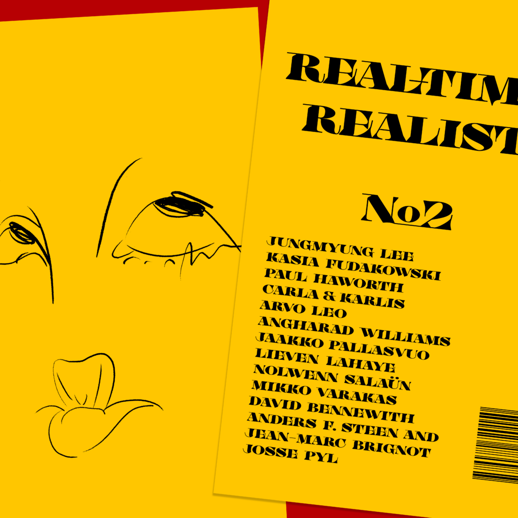
Release: Real-Time Realist No.2 l 5 November 2019
Real-Time Realist No. 2 – Yellow Wheel: Joy, Ecstasy, Love, and Serenity – was published in September 2019, co-edited with guest editor Lieven Lahaye and designed by Jungmyung Lee. The second issue sees the aforementioned emotions distilled into contributions by Kasia Fudakowski, Paul Haworth, Carla & Karlis, Arvo Leo, Angharad Williams, Jaakko Pallasvuo, Lieven Lahaye, Nolwenn Salaün, Mikko Varakas, David Bennewith, Anders Frederik Steen and Jean-Marc Brignot, Josse Pyl, and Jungmyung Lee.
